Earlier this evening, I uploaded the revised W20 & W21 series signs for work zones. And like other sections of the Manual, the PDF files incorporating distances or other varying legend are set to be user-editable (In Acrobat or Acrobat Reader).
This means I’m nearly finished with the entire section on warning signs – in fact, I think I can see the (rotating, flashing, oscillating or strobe) light at the end of the section. 🙂
I’m currently plowing through the revamp of the W11 series signs for advance warning of persons / animals / things / etc. Most of these signs use symbols to depict the object that a road user should try not to hit. As part of this revamp, I’m re-creating all the symbols from scratch, as I’ve discovered the symbols used in earlier editions of this Manual aren’t as exactly conforming to the FHWA standard symbols as I would want.
Some of the symbols, like the pedestrian and bicycle, are relatively simple. And then you get the more challenging ones, like the golf cart or horse-drawn vehicle. But I thought the old-fashioned Hoyt-Clagwell tractor on the W11-5 was going to be the toughest one to trace.
Until I met… The Moose.
The W11-21 is ridiculously complex. Goofy antlers with shadows, funny hooves, and the droopy dewlap. Plus an evil eye. Here’s a close-up of one of the antlers:
Not the simplest symbol to work on…
So, it’s going a bit slowly, but the resulting W11 signs should be excellent. If I don’t go nuts first.
But then I realized: with the W10s done, all I’d need to do is update a few I series signs, and I could complete the Railroad and Light Rail Signs section (the R15s were done late last year).
So I started working on the I-7, I-12, and I-13. But I didn’t want to leave the section only halfway done, so I finished up all the I series information signs.
And then I updated the Guide and Information Signs navigation page too, even though any meaningful work on the D, E, and Recreational/Cultural Signs is still lurking in the future.
So, here’s what’s new as of very late on the Ides of March:
Creating all-new sign images for the new edition of the Manual of Traffic Signs has been an interesting experience. While many of the signs have retained the same layout and dimensions for decades, other signs have changed subtly or significantly in terms of dimensions, symbology, or other factors.
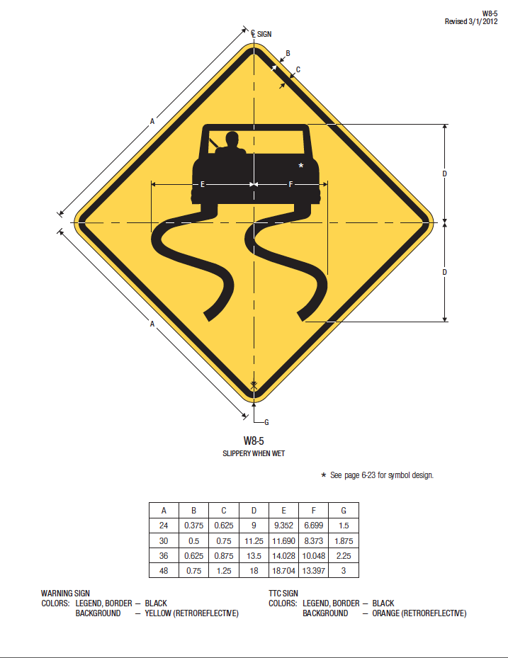
I’m working on the W8 series of signs, and I get to the W8-5 burnout Slippery When Wet sign. As I do for almost all signs, I look in both the 2004 FHWA Standard Highway Signs book and the 2012 Supplement, and see that the W8-5 was revised in the 2012 supplement. No problem. I open the 2012 layout, and see that there’s a revised symbol – the car is wider, the driver is wearing a seat belt, and the driver’s head is no longer a generic oval.
The page says, “See page 6-23 for symbol design”. But there’s no page 6-23 in the 2012 Supplement. So I go to page 6-23 in the 2004 Standard Highway Signs book, and I behold a slippery when wet symbol – but it’s the old one, not the new one.
I think to myself, “Will anyone notice if I follow the instructions to the letter and use the 6-23 symbol?” But then I think, “Nope, then the sign doesn’t match what’s clearly shown on the 2012 SHS Supplement page. Dang.”
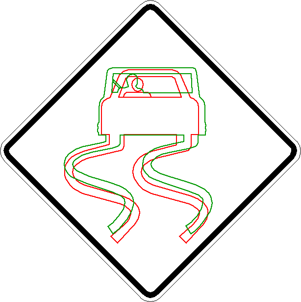
So, how different are they? Take a look:
(red is the pre-2012 design, green is the current design)
Yep, that’s quite a difference.
Readers may not realize this, but every single symbol you see in my Manual of Traffic Signs website is an original vector graphic created by me on the computer based on official source material, almost always the Standard Highway Signs book. I don’t use scans or rasters in my source drawings – everything’s drawn as vectors and curves as exactly as my software will allow, and by me personally – I don’t use or purchase symbol libraries created by others, as I’ve found they can vary quite a bit from official layouts.
So now what? I need the layout details for this symbol, but the FHWA documentation doesn’t contain it, other than the symbol on the 2012 version of the W8-5 sign.
OK, if that’s what I’ve got, then that’s what I’ve got.
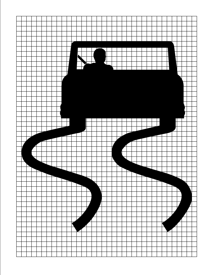
I made a high-resolution screen capture of the 2012 W8-5 sign, cleaned it up a bit in Graphic Converter, and then used the “trace” tool in my trusty ol’ Macromedia Freehand 7 software to trace the symbol into a vector graphic.
But even though the Freehand trace tool is rather talented (especially for a 25-year-old hunk o’ software), the results are never quite as exact as I prefer. So I zoom wayyy in and adjust the curve and line points to match the symbol as close as the resolution will allow. It’s not always easy, but I want to provide users with the best graphics I can practically provide.
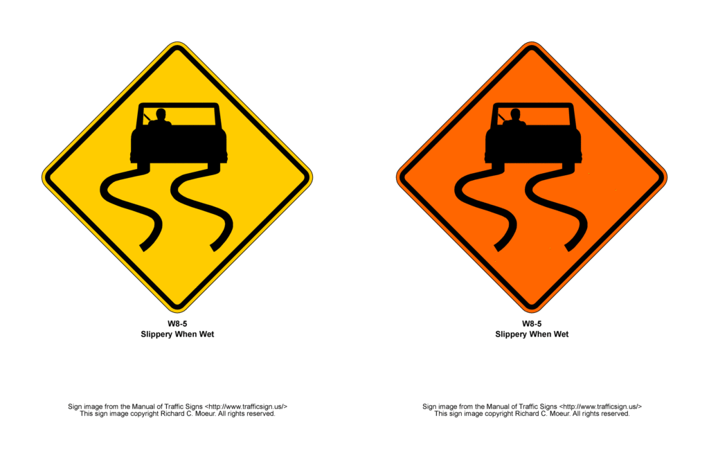
I wrangled the graphic into acceptably good shape, imported it onto a standard sign blank, scaled it to the dimensions in the drawing, and then created all reasonably expected color variations (in this case, just yellow and orange). I then scaled these onto standard letter-size pages and generated .gif and PDF versions. And I’ll have to say I’m reasonably satisfied with the results.
But realizing that users might want the details for the graphic for their own use, I also created a “grid” drawing of it in a manner similar to the symbols in FHWA’s Standard Highway Signs book. I generated it as a PDF and appended it to the SHS PDF file for the W8-5 on the site. It may not be “officially blessed” by FHWA, but it can serve as a “stopgap” reference until FHWA publishes the “official” version (no, I don’t know when that might be either.) 🙂
There are a lot of W8s (31 in total, including plaques), so I’m hoping to have them done and posted by next week, as other activities (leading weekend rides for the bike club, rockets and other fun with the family, next week’s ITE/IMSA conference, etc.) will also occupy my time.
Thanks for reading, and I thought you all might be interested in the little “behind the scenes” glimpse into some of the challenges of creating and updating this website.
As of today, the Warning Sign section is complete through the W7 (Hill) series of signs. While we’re not quite “over the hill”, substantial progress is being made. Unless there are other time-stealing complications, expect 1 to 2 Warning sections to be updated each week.
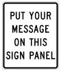
Enjoy the improved sections, and don’t forget that signs with messages that might be user-specified (percent grade, distance) have PDF files that allow users to edit those signs to say exactly what they need (when opened in Acrobat Reader or Acrobat).
Feel free to leave a comment if you have any feedback or suggestions.
It’s been a few months since the Manual of Traffic Signs was updated. But a difficult autumn, the holiday season, NCUTCD, and TRB are now behind us, and work has resumed on the website.
I asked users whether work should be prioritized on route marker signs or on warning signs, and the responses were roughly evenly split. So, just to make things more challenging, I chose to update both (which explains some of the delay).
The PDFs for the M1 series route markers allow users to change the route numbers and other information (state name on Interstate shields, county name on M1-6s, etc.) Try it out!
I thank you all for your patience. The plan for now is to continue updating both the marker and warning sign sections one piece at a time (M2s and W2s, M3s & W3s, etc.) as I have the ability. We’ll get them both done in due time – hopefully before the rulemaking on the next edition of the MUTCD.
As you might or might not have noticed, there has not been any noticeable progress on the Manual of Traffic Signs since the completion of the Regulatory Signs section a while ago. I assure you that things are happening behind the scenes, mainly in experimenting with some rather-challenging user-editable PDF files.
However, it would appear not everyone is content. I do have a person who e-mails me periodically expressing a seeming lack of satisfaction with progress on the website. Today’s e-mail was short and to the point:
“Better hurry before I lose patience.”
Last time I checked, this site is (and has been for over two decades) a free resource open to all. And at my last recollection I have no contracts with anyone demanding that product be delivered by a specific date. I also have many other demands on my time such as my family, maintaining a house, volunteer work, and other things that keep me remarkably busy from wake-up to crash-out. Plus preparing for upcoming meetings in DC in January. So I find it both amusing and irritating that someone I’ve never recall meeting and with whom I have no professional or personal relationship sees themselves as making such a confident demand/threat on my time and resources.
Rest assured progress will be seen – perhaps not immediately, but in good time. And I think nearly all of you will be happy with the results. Except maybe for this guy.
Merry Christmas, happy holidays, and all that from the Manual of Traffic Signs, and hope to have something up soon.
Also added a set of regulatory signs where users can edit them to display nearly any desired message. Options from one to five lines available, all in Federal Series C text for clarity and uniformity.