Typefaces Used for Traffic Signs
The standard typefaces used for highway signs in the US are defined in the "Standard Alphabets for Traffic Control Devices" published by the Federal Highway Administration, also known as the "Federal Series" of typefaces.
In general, the higher the series, the wider the text, and the better legibility at travel speeds and longer distances.

|
Discontinued. Used on pre-1960 signs for narrow text. |

|
Used on parking signs and other signs where narrow text is required to fit the sign panel. |

|
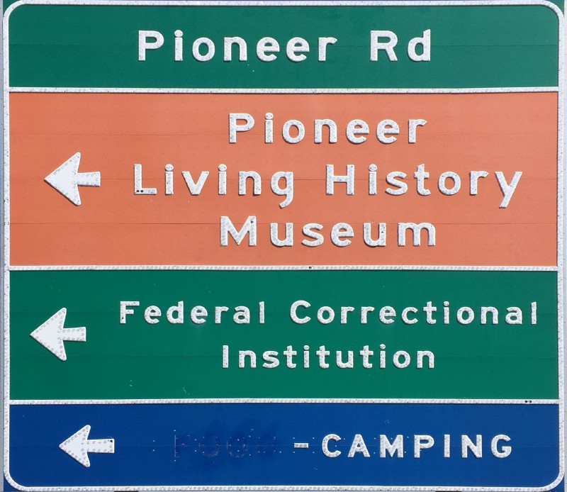
Used on street name signs, regulatory and warning signs, and other signs where width is balanced with sign panel size. |

|
Used on guide signs for conventional roads, regulatory and warning signs, and other signs. A good general purpose sign typeface. |

|
Used on regulatory, warning, and guide signs for higher-speed highways. |

|
Standard typeface for guide signs on expressways and freeways. |

|
Limited Use. Used for some signs where extra letter width is desirable. |
The official designations for these typefaces are "FHWA Series B", "FHWA Series C", etc. In recent years, a practice has developed of referring to these standard typefaces as "Highway Gothic". This has caught on to the point where even FHWA occasionally refers to their own typefaces in this manner. However, for clarity, it's probably better to refer to these typefaces with the more correct 'series' name.
For many years, the Series B, C, D, E and F typefaces included only all capital letters. In 2004, however, FHWA created and approved lower-case letter designs for all these series of typefaces, and recent changes to the MUTCD have approved the use of lower-case legends for guide sign legends on all classes of roadways. However, nearly all regulatory and warning signs are still required to use text in all capital letters.
The lower case loop height for lower case letters is 75% of the upper case height. For example, a lower case 's' is 75% of the height of an upper case 'S'.
The reason Series E Modified is called 'modified' is because the letter stroke (width of lines making up letter) is modified to be 20% of the letter height. For comparison, standard B though F letters have a stroke width approximately 13-18% of height.
| Federal Highway Administration Standard Alphabets for Traffic Control Devices |
| 1952 Standard Alphabets, including geometric layout info for Series A through F |
|
A newer series of typefaces developed for use on guide signs is Clearview. Clearview is approved for use under a Federal Highway Administration Interim Approval, but only for guide signs with "positive-contrast" legends; e.g. signs with white or light legend on a darker background. A number of studies have been performed on Clearview, with varying results. Some states and other agencies now use Clearview for guide signs on their highways and other roadways. Clearview has two main typeface groupings - the W series for white or light letters on darker text, and the B series for dark text on a light background. At this time, only the W series typefaces are allowed for use under the FHWA Interim Approval. There are seven typefaces in the Clearview W series - 1W through 6W, corresponding roughly to Federal Series B through F, and 5WR, a variant on 5W that uses narrower between-letter spacing to fit in the same width as a comparable sign legend in Federal Series E Modified. |
|
Other typefaces are in use for signs in certain locations in the US.
|
Button Copy "Button copy" is a generic term for highway sign characters which are made out of enameled metal, with small white circular reflectors (the 'buttons') inlaid in the surface to provide retroreflectivity at night. Button copy typefaces closely resemble standard FHWA Series D, E, and Series E modified typefaces, except for minor differences to accommodate the inlaid reflectors. This style of lettering was in use for decades across the country for large expressway and freeway guide signs. Button copy is no longer manufactured in the United States as of the early 2000s, as it could no longer compete cost-wise with newer computer-cut reflective sign letters, and it does not meet new requirements for minimum retroreflectivity in the MUTCD. Most button copy signs in the US have been replaced, but some are still in place in Arizona, California, Ohio, and other states. |
|
|
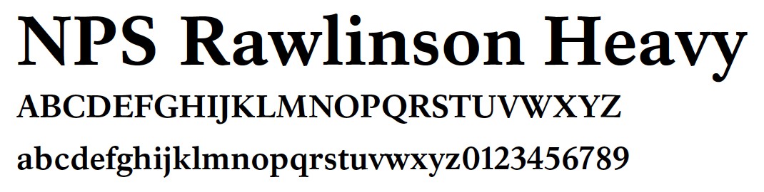
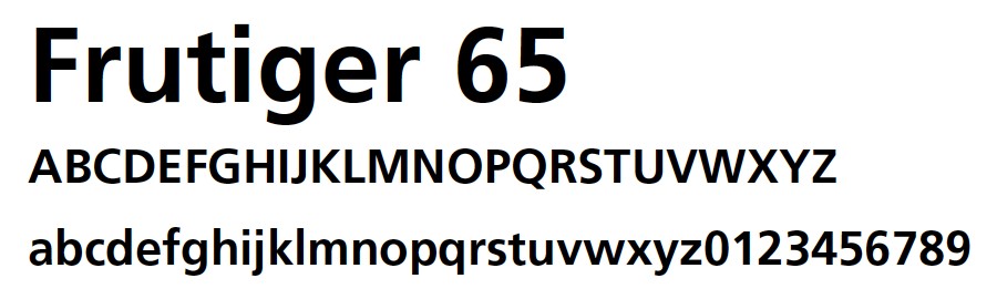
National Park Service On roadways within national parks, the National Park Service (NPS) uses two typefaces for wayfinding, information, and other signing within the park, in accordance with the Uniguide sign system adopted by NPS. The two typefaces are NPS Rawlinson and Frutiger 65. In the past, Clarendon was used for NPS signs, but is being phased out in favor of these two new typefaces. |
|
There are companies that sell professional-level software for sign design and layout. While these software packages can be expensive, the cost savings for high-volume production of signs can be considerable. Most state DOTs and many other agencies have standardized on one of the following two software packages:
Updated 30 October 2019 (sign font information revised and folded into this page)
Scripting: Richard C. Moeur
All text and images on this page © Richard C. Moeur. All rights reserved.
Linked sign layout files in PDF format provided courtesy of
FHWA's MUTCD website
Unauthorized use of text, images, and other content is strictly prohibited. Refer to
Copyright, Disclaimer, and Standard Use Agreement
for details.

